Ad hooks for products nobody has heard of yet
By the Floow editorial team
A hook is the opening of your ad, on screen and in voice, that gives people a reason to keep watching during the first 2-3 seconds. When nobody knows your product, introducing it by name doesn't work: the viewer has nowhere to place it. Openings the viewer already recognizes work better: a specific friction, a visible result, a real doubt, or a comparison with what they do today.
The product demo comes after. Below are seven openings, each with a complete scene, a sign that it isn't working, and a way to test it by changing only the hook. The examples use an invented product, a thermal bottle that alerts your phone when your coffee is getting cold. They are examples, not scripts to copy word for word.
Hooks that start from what the buyer already lives with
These three hooks don't explain the product. They acknowledge something the viewer already has in mind. They ask for the least information, which is why they suit a brand nobody knows.
The small friction describes the annoying moment that happens right before someone needs the product. You don't need to dramatize it: the more observable the scene, the less explaining it needs.
Example. On screen: a forgotten coffee cup next to a laptop, with big text reading "Your coffee, at 11:40." Voice: "You make it at nine and find it cold mid-morning. Again." Visual: a hand lifts the cup and makes an annoyed gesture.
Sign it fails: people relate, but retention drops after second 5. That usually means the friction is so common that nobody expects a new solution.
The daily ritual places the product in a moment of the day that already exists, so it stops being a strange object. Here the hook explains nothing: it shows a recognizable routine.
Example. On screen: the text "My 7:30 routine." Voice: "I filled the bottle, closed it, and forgot about my coffee until the meeting." Visual: an ordinary morning in the kitchen, with no fast cuts.
Sign it fails: the video looks like a lifestyle ad and nobody understands what problem it solves. It looks pretty and doesn't sell.
The real objection says the buyer's doubt out loud. A specific objection communicates category, risk and past experience in a single sentence, but it only works if the doubt really exists. The demonstration that follows must resolve it, not jump to another promise.
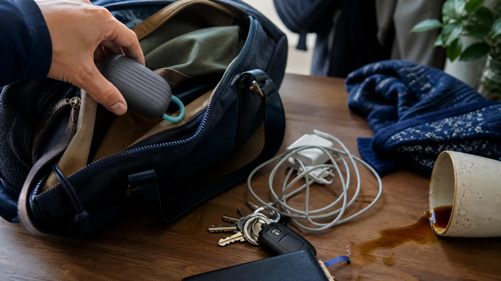
Example. On screen: the text "Another bottle that will end up in the cupboard." Voice: "I thought the same about this one." Visual: the bottle inside a backpack and a gentle knock against the table.
Sign it fails: good opening metrics, but comments that repeat the objection. The answer arrives too late or doesn't convince.
Hooks that show instead of explain
When the change is visible, the image does the work the name can't do.
The result before the name opens with the change and delays the introduction. Curiosity comes from the difference, not from hiding information. Explain quickly what made it possible, or it will look like an editing trick.
Example. On screen: a close-up of steam rising from a bottle at four in the afternoon, with the text "Hot coffee, seven hours later." Voice: "I made this this morning." Visual: the lid opens and the cup is poured.
Sign it fails: people stop scrolling, but comments ask what it is or what it's for. The result grabs attention, but the product isn't understood.
The comparison with what they do today takes advantage of the fact that the buyer doesn't know your product but does know their current solution. Putting the two side by side creates instant context.
Example. Split screen: on the left, an ordinary thermos; on the right, the bottle with a phone notification, and the text "Regular thermos vs. this." Voice: "With one you guess the temperature. With the other you see it." Visual: a hand holds both objects and the phone buzzes next to the bottle.
Sign it fails: you get compared to the wrong alternative. If comments mention another product, the frame isn't the one you expected.
Hooks that build trust
These two hooks don't try to stop the scroll with an image. They give a reason to believe what comes next.
The discovery tells where you came across the product. It brings closeness and needs a believable detail, not a generic "someone recommended it."
Example. On screen: the text "I saw it on a coworker's desk." Voice: "I thought it was a normal bottle until his phone went off." Visual: an office with natural light and the phone screen lit up.
Sign it fails: it feels like a scripted performance. If retention falls right after the hook, the story is unnecessary or runs too long.
The limit clarifies who the product is not for. Setting a limit raises credibility and filters out the wrong buyer, and it shows you understand the product better than a list of benefits does.
Example. On screen: the text "If you drink your coffee in ten minutes, don't buy it." Voice: "This bottle is for people who leave the cup half finished." Visual: a work desk with three half-drunk cups.
Sign it fails: few clicks, but the ones who arrive buy. If that happens, you may be filtering too much and leaving yourself without enough volume to learn.
Which one to choose based on what the buyer knows
Start from what the viewer already knows. If they don't know the category, begin with the friction or the ritual. If they know the category but not your brand, use the comparison or the objection. If they are already comparing options, the limit and the result build more trust.
To get started, I would test the small friction and the result before the name. These are the two openings that need the least explanation, and they tell you quickly whether the problem interests people.
Whichever you pick, make it clear before clever, don't promise anything the video doesn't deliver, and make sure the hook, the video and the landing page tell the same story.
How to adapt them to each platform and test them
On Reels and TikTok the video is vertical and many people watch without sound, so the hook has to work with just big text and the image, leaving the bottom area free where the platform puts its buttons. On YouTube viewers usually expect a bit more context and sometimes have sound on, but the first seconds still decide whether they stay. The same hook can work on all three if you take care with text and framing.
To test them, change only the hook and keep the body and the call to action. Test three or four variants at once, with the same audience and similar budget. Look at retention in the first seconds and CTR, but also whether the people who click are the right buyers. If you don't know how to read a result, read what I would change first when a winning ad stops working. And if the hook works but the ad fails afterwards, the problem is in the body, as this breakdown of UGC ads that lose viewers after the hook explains.
Testing seven openings means producing many versions of the same video. With Floow, the AI UGC video generator for ads, you can build variants with the same body and different openings and check which one attracts your buyer. The hook is still your decision: the tool only makes it cheaper to run more tests.